22.3 It’s called contrast, baby!
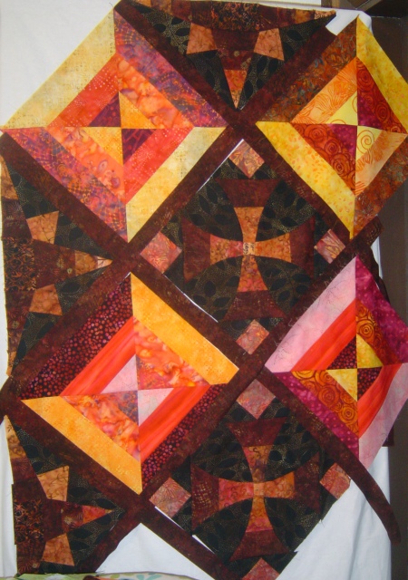
January 22, 2012The super bright “hot flashes” quilt, a year later, is coming up dark.
Dark and warm at the same time.
Halloweeny & fally and warm looking.
I have been sacrificing all other projects, swishing away at all other quilt desires to gain a little more time in working on this quilt.
So I’ve been making progress. Feeling like finally, I can see the top completion in sight in the (somewhat) near future.
I haven’t started much on the corner squares except for cutting out the templates.
I’ve gotten a good system and a good start on the side blocks being completed. Which makes me happier with the progress from this weekend than last. But last weekend was a little bit different than the norm.
This weekend I didn’t have Saturday and Sunday to work fully (due to work schedules), and so I barreled on my progress on quilting rather than podcasting. Have topic, will record soon – need more time to work on details than I had.
This quilt has come up much darker than I thought, but at the same time, retained the same feeling. The dark black and orange is repeated in the alternate & side blocks, while the fun bright blocks are scrappy and changing.
I really like the contrast this pulls out even though it’s dark.
But it’s also light because of all those bright yellows and such.
And the quilt has points, and curves and all sorts of lines to look at.
Here are some more progress pictures that I have been working on the past two weeks or so.
First I subcut my strips into strip segments using templates created from EQ7.
Then as I was cutting the subcuts into the pieces I needed, the template kept slipping away from my ruler. On New Years, I cut INTO my templates accidentally occasionally, and I didn’t want to repeat that, so I used masking tape.
The edge of the ruler is at the edge of the template. This way I could see what I had already cut and line everything up clearly.
And I just had to move the ruler, this made the strips SO MUCH easier to cut without thinking too much (necessary after this week).
And you know those little corners, also necessary to cut, the tiny little pieces at the corners of the triangles, helped immensely in lining up my blocks later & keeping them without too many puckers.
This is all the discarded pieces making a pie shape on my cutting mat.
I don’t know for sure what I’m doing with these, but an idea is here regardless. It’s a 10 sided figure it looks like. One of the ‘-agons’
This is a stack of pieces that I haven’t sewn together yet, but it seems like the best solution in the ‘semi paper piecing’ that I’ve been doing.
These become the side blocks. There is a little fudging that happens at the change of direction on the seam, but not a ton. Of course the tucking is minimized by the fact that my pieces are actually cut down to the exact size of the template. Go figure that’s how it works best. LOL.
But the work and thought to the non distracting alternate blocks is paying off. My initial draw to the black fabric is the best choice, and three of the 4 initial fabrics I purchased for this quilt after making some of the blocks, they have found a presence in this quilt as well.
I am not incredibly fond of orange, and actually after working on this quilt, I want to dive into blues and purples a lot, but I KNOW it expanded my color pallete AND my stash.
I started the pieces of this quilt a year ago or so, and it’s only been hard driven to finish when I noticed my comforter is falling to pieces rapidly.
It’s definitely not one of those ‘quilt in a weekend’ type of designs, and has so many parts to it that of course it’s a slower, longer project than I normally finish.
But, it’s making me feel good to complete. And will be worth my time in the end. I am trying to figure out what kind of quilting designs will work best for this quilt or even if I want to go light or dark with the quilting on it. Or both. We’ll see, I have a long way to go until it’s quilted, but starting to see the end is closer than I think! 🙂


I like the dark – it calms down the bright blocks. Great choices of colours, Darla!
These colors are very rich. Very complex- more than I want at the moment.
I like the warm colors. I would be ready to curl up by the fire with a good book.
Vikki
ooh…I want some of those oranges…and I hate orange.
have fun!